Johns Hopkins Center for Systems Science and Engineering (CSSE) has provided a curated collection of all the US and global details of confirmed cases, deaths, and recovery from the COVID-19 pandemic. This COVID-19 data is available on GitHub here, and it is easy to download the entire set of CSV files.
The Dev Rel team at MongoDB has made this data even easier to access by creating a public, read-only data set on MongoDB Atlas.
The connection URI for the read-only data set is:
mongodb+srv://readonly:[email protected]/covid19
The username and password are both readonly.
You will find two different databases: covid19jhu contains the raw, original Johns Hopkins data, and covid19 is the curated MongoDB database with indexes.
Accessing the covid19 database
I used Studio 3T to access the covid19 database for several reasons.
Firstly, it has a lot of ways of making life simpler for users. You can cut and paste from it to Excel when you’re doing one-off exploratory work, and there is a task scheduler (e.g. for setting up daily exports) for keeping everything up-to-date.
I also have a particular weak spot for the Aggregation Editor, and a slightly fractious love-hate relationship with the SQL Query tool.
Connecting to MongoDB Atlas was easy, done by pasting the URI.

A moment later, and we are in.
Exploring the statistics collection
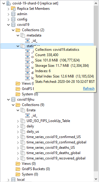
Hmm. Nice. Unlike the raw covid19jhu database, MongoDB’s covid19 database has six suitable indexes, and the database is properly curated to make most queries easy. We ought to just check that we have the data there properly.
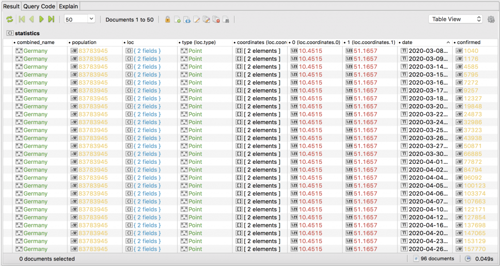
A quick inspection of the data in the statistics collection tells me that the individual documents relate to a province/region or an entire country.
Each document represents a day’s figure for the region or country, but shows accumulated total figures to that date for confirmed (see screenshot), deaths, and recovered – not actual daily figures.
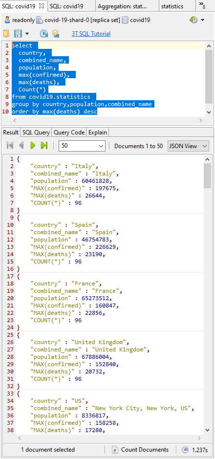
To get things rolling, I turn to the SQL Query window, spit on my hands, and tap in the SQL query (here’s the snippet) that tells me the current incrementing total figures for confirmed cases and deaths by finding the MAX() value.
As I write this, we are expecting 96 records per area. The deaths are an incrementing total, so we just need to find the MAX() value for the current deaths (I over-simplify: it is possible for an error to be corrected downwards, but this would only affect the figures if it happened near the peak.)
Finding trends in COVID-19 data
Fine so far. I can check the population figures (https://worldpopulationreview.com/countries/) and the current deaths for each country/region/province, but what I really want is to aggregate deaths by country, and more importantly, I want to know the death rate as a percentage of the population.
It is a statistic that many foolish commentators have ignored while making pronouncements about the pandemic. One must just sigh, and wish that they’d stayed awake in elementary school maths.
Unfortunately, the SQL Query feature of Studio 3T is beginning to run short of breath at this level of complexity. We can take the query and edit it in the Aggregation Editor without too much stress.
Click on Query Code and choose mongo shell (here’s the full MongoDB query). Then, click the org chart-looking icon.
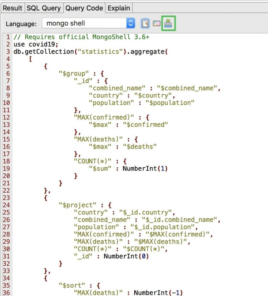
This opens the SQL query as a MongoDB aggregation query, broken down into stages, in a separate tab.
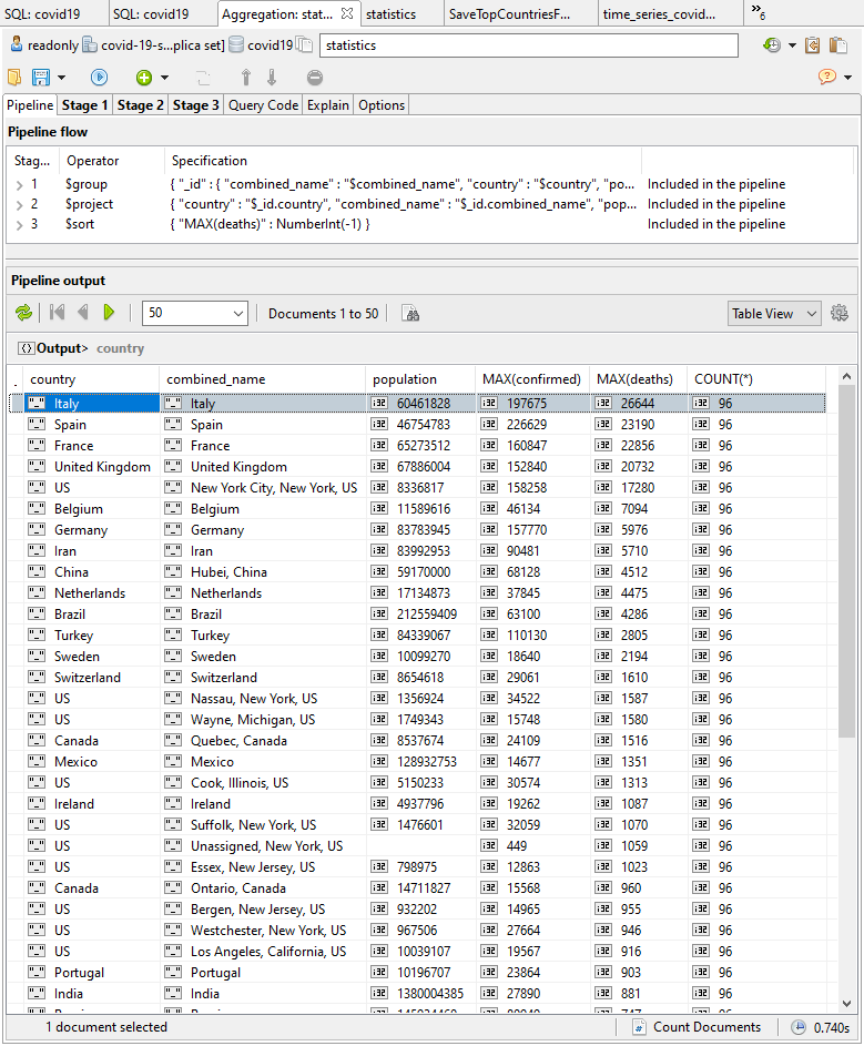
Now we can add a new $match stage to display regions with a population greater than zero, and a $group stage to combine the regions into countries (here’s the aggregation query with the additional stages).
By doing some maths on the projections, we can calculate the metric we want, which is the death rate as a percentage of the population.
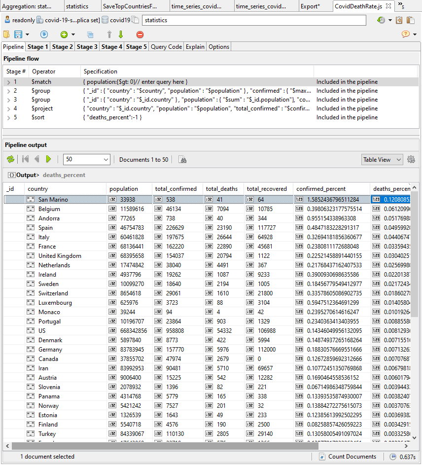
OK. This looks more useful. We can see the worst-affected countries at the top.
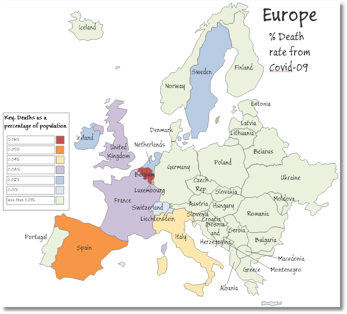
COVID-19 death rates in Western Europe as a percentage of population
Now that we have the query results that show us the worst-affected countries, we can now import this data into Excel.
To do this, we simply export the query results onto the clipboard as a tab-delimited version of a CSV file. Tab-delimited CSV (TSV) is usually the best clipboard format for transferring tabular information between Windows applications on the clipboard.
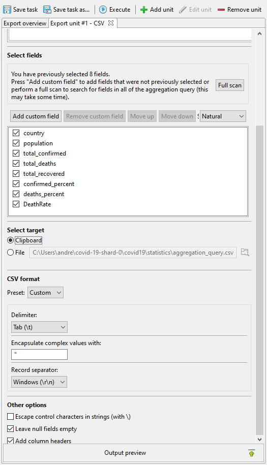
Click on Execute, which runs the export in a couple of seconds.
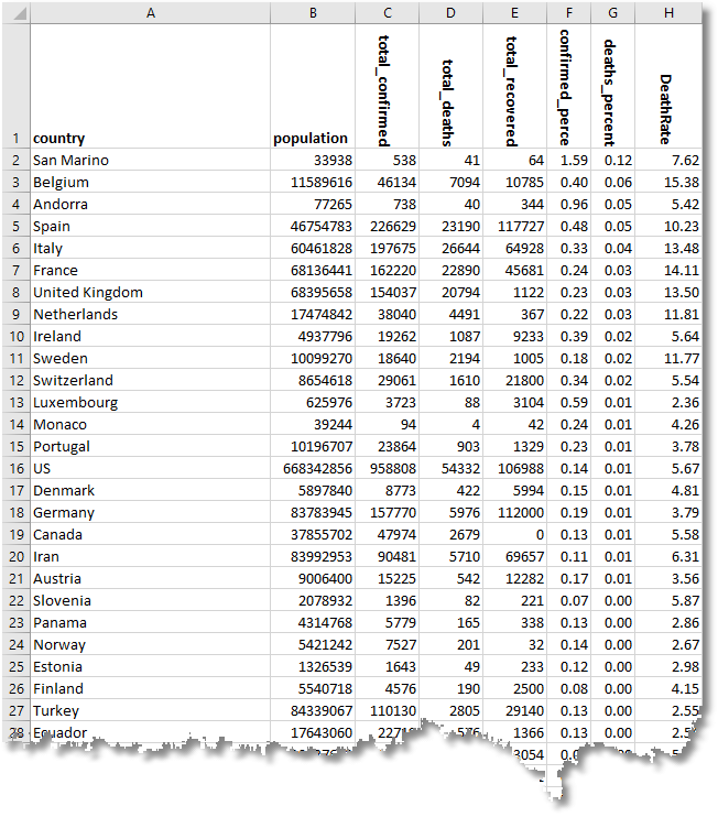
With this, we can map out the relative death rate for Western European countries, where the deaths as a percentage of the population were particularly severe. Actually, it may just be an effect of a more honest attempt to get a true figure of the deaths from the virus.
Here is the summary as of the time of writing, which shows that Belgium, Spain, and Italy have seen the highest death rate percentages.
Plotting bell curves of infections and deaths
Each country has a wildly different curve, depending on when the infection reached it via a “superspreader” (someone who was symptomless, but highly infectious).
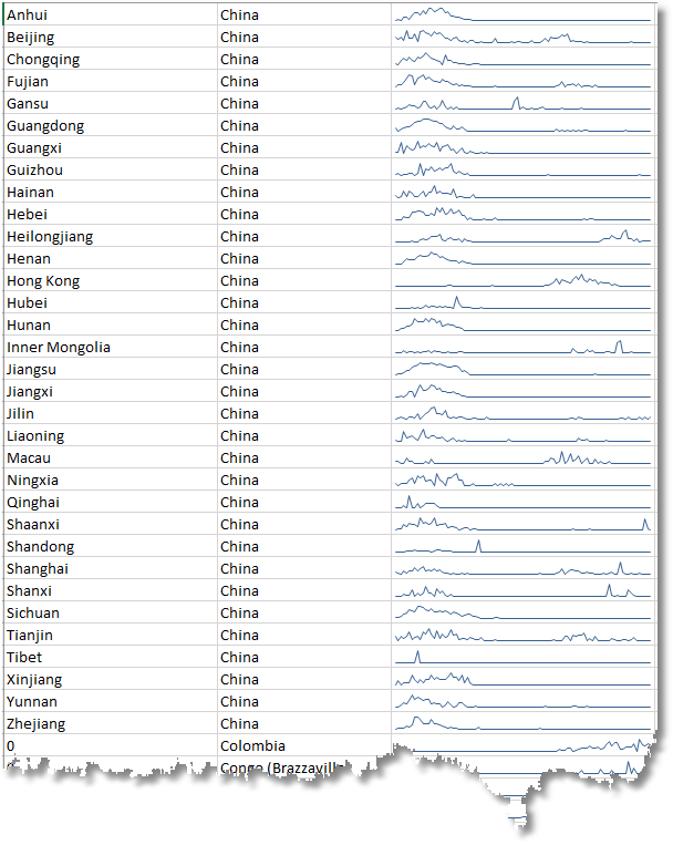
Here we examine the frequency of confirmed cases of infection in the provinces of China as part of a complete data set. We are using sparklines as we’re not interested in the detail at this stage. We want to see the pattern of rise and decline, the bell curve.
This isn’t easy to do in MongoDB. The raw data, you’ll remember, is the total figure to date for confirmed, deaths, and recovered – not daily figures.
Here is a sample.
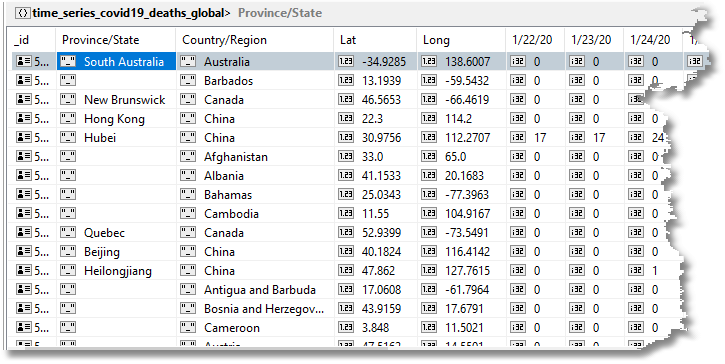
In Excel, we can easily paste into a sheet a running tally like the above and convert the figures into deaths per day.
What we do is to use Studio 3T’s export mechanism to paste a tab-delimited version of the table above with the accumulated data into a ‘data’ sheet. We then sort it by country and province.
Then, we create another final ‘display’ sheet that computes the difference for each day’s figures of that cell and the previous day’s cell. That will be the number of deaths on that day.
We add the sparklines to the display sheet and do all our graphing and analytics from the display sheet.
We used this display sheet to show the sparklines for the provinces of China that we showed above. It highlights the way that the infection initially spread.
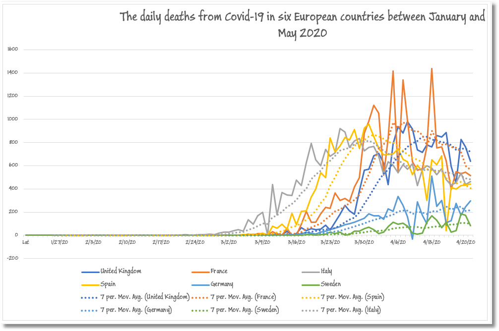
From this same ‘display’ sheet, we were then able to do a range of analytics for which Excel is ideally suited. As an example, we could look graphically at the death rates over the pandemic for six European countries – Spain, France, Germany, Italy, Sweden, and the UK – along with a moving average to show the progress along the typical pandemic bell curve.
It isn’t so easy in MongoDB to transform the running totals that we find in the published data into daily figures. This sort of thing is best done as a post-processing on the running cursor of results, but even then, this can only be done one region/province/country (a document) at a time, or for the full global figures.
Even in a relational database, it is tricky to do. It can be done but awkwardly in a SQL grouping but there is no equivalent technique in MongoDB.
A workaround is to run an aggregation query using $group, $project, and $sort (here’s the code), and then post-process the deaths to convert them to a daily tally. This query was developed below using Studio 3T’s IntelliShell.
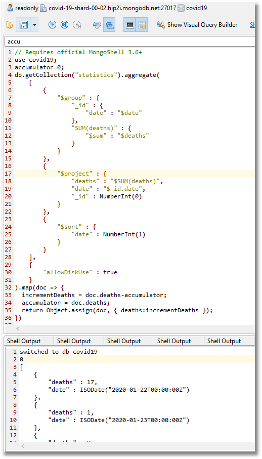
The results can be pasted into a new collection in a separate read-write MongoDB database.
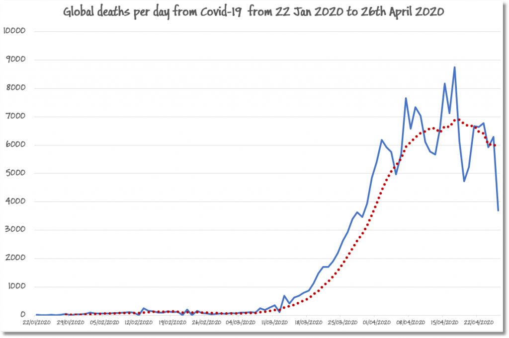
From there, one can export it straight into Excel where you can generate a graph of the global deaths from the pandemic.
I’ve produced such a graph below, where I’ve added a seven-day rolling average in red dots to show the classic bell jar curve of the progress of the pandemic.
Conclusion
It is a painful process for any data scientist to engage in research that serves to look at human suffering drawn as a graph, especially with relatives working as medics in intensive care. In this case, the consolation was to see, almost everywhere, the decline in the deadly consequences of the COVID-19 virus (thank goodness).
To have the data available is important and we can give thanks to Johns Hopkins University for so promptly making their data available, and for MongoDB for publishing the database on MongoDB Atlas.
Query snippets
SQL query to find the MAX() value
select
  country,
  combined_name,
  population,
  max(confirmed),
  max(deaths),
  Count(*)
from covid19.statistics
group by country,population,combined_name
order by max(deaths) desc
The same SQL query as a MongoDB aggregation query
// Requires official MongoShell 3.6+
use covid19;
db.getCollection("statistics").aggregate(
    [
        {
            "$group" : {
                "_id" : {
                    "combined_name" : "$combined_name",
                    "country" : "$country",
                    "population" : "$population"
                },
                "MAX(confirmed)" : {
                    "$max" : "$confirmed"
                },
                "MAX(deaths)" : {
                    "$max" : "$deaths"
                },
                "COUNT(*)" : {
                    "$sum" : NumberInt(1)
                }
            }
        },
        {
            "$project" : {
                "country" : "$_id.country",
                "combined_name" : "$_id.combined_name",
                "population" : "$_id.population",
                "MAX(confirmed)" : "$MAX(confirmed)",
                "MAX(deaths)" : "$MAX(deaths)",
                "COUNT(*)" : "$COUNT(*)",
                "_id" : NumberInt(0)
            }
        },
        {
            "$sort" : {
                "MAX(deaths)" : NumberInt(-1)
            }
        }
    ],
    {
        "allowDiskUse" : true
    }
);
Aggregation query with additional match and group stages
// Requires official MongoShell 3.6+
use covid19;
db.getCollection("statistics").aggregate(
    [
        {
            "$match" : {
                "population" : {
                    "$gt" : 0.0
                }
            }
        },
        {
            "$group" : {
                "_id" : {
                    "country" : "$country",
                    "population" : "$population"
                },
                "confirmed" : {
                    "$max" : "$confirmed"
                },
                "deaths" : {
                    "$max" : "$deaths"
                },
                "recovered" : {
                    "$max" : "$recovered"
                },
                "latest" : {
                    "$max" : "$date"
                },
                "first" : {
                    "$min" : "$date"
                },
                "count" : {
                    "$sum" : NumberInt(1)
                }
            }
        },
        {
            "$group" : {
                "_id" : {
                    "country" : "$_id.country"
                },
                "population" : {
                    "$sum" : "$_id.population"
                },
                "confirmed" : {
                    "$sum" : "$confirmed"
                },
                "deaths" : {
                    "$sum" : "$deaths"
                },
                "recovered" : {
                    "$sum" : "$recovered"
                }
            }
        },
        {
            "$project" : {
                "country" : "$_id.country",
                "population" : "$population",
                "total_confirmed" : "$confirmed",
                "total_deaths" : "$deaths",
                "total_recovered" : "$recovered",
                "confirmed_percent" : {
                    "$multiply" : [
                        {
                            "$divide" : [
                                "$confirmed",
                                "$population"
                            ]
                        },
                        100.0
                    ]
                },
                "deaths_percent" : {
                    "$multiply" : [
                        {
                            "$divide" : [
                                "$deaths",
                                "$population"
                            ]
                        },
                        100.0
                    ]
                },
                "DeathRate" : {
                    "$multiply" : [
                        {
                            "$divide" : [
                                "$deaths",
                                "$confirmed"
                            ]
                        },
                        100.0
                    ]
                },
                "_id" : NumberInt(0)
            }
        },
        {
            "$sort" : {
                "deaths_percent" : -1.0
            }
        }
    ],
    {
        "allowDiskUse" : false
    }
);
Aggregation query to convert deaths to a daily tally
// Requires official MongoShell 3.6+
use covid19;
accumulator=0;
db.getCollection("statistics").aggregate(
    [
        {
            "$group" : {
                "_id" : {
                    "date" : "$date"
                },
                "SUM(deaths)" : {
                    "$sum" : "$deaths"
                }
            }
        },
        {
            "$project" : {
                "deaths" : "$SUM(deaths)",
                "date" : "$_id.date",
                "_id" : NumberInt(0)
            }
        },
        {
            "$sort" : {
                "date" : NumberInt(1)
            }
        }
    ],
    {
        "allowDiskUse" : true
    }
).map(doc => {
  incrementDeaths = doc.deaths-accumulator;
  accumulator = doc.deaths;
  return Object.assign(doc, { deaths:incrementDeaths });
})


