Need to optimize MongoDB queries? Visual Explain is a performance tuning tool that shows the stages MongoDB took to run a query, with runtime statistics. Use Visual Explain in combination with Query Profiler to find slow queries and detect missing indexes so that you can optimize MongoDB performance. Use Index Manager to add indexes, edit indexed fields, and check out index usage.
Performance tuning with Visual Explain
Visual Explain is a visual representation of the output from the MongoDB explain () method. With its in-depth view of the MongoDB query plan, Visual Explain helps you to investigate queries and:
- Know when to add an index
- Spot uneven shard loads
- Optimize queries by applying relevant filters first
- Debug queries
Know when to add an index
To illustrate how useful Visual Explain can be, let’s take a look at the titles collection, which is part of the Pubs database.
It contains 10,000 documents, each containing 12 fields: _id, title_id, title, type, TypeList, pub_id, price, advance, royalty, ytd_sales, notes, and pubdate.
To test how expensive a query can be, let’s run a simple query in Visual Query Builder.
Let’s sort the collection by price in descending order:
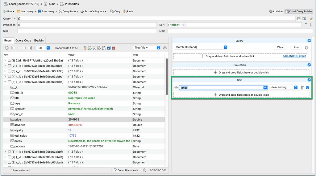
db.getCollection("titles").find({}).sort(
    {
        "price" : -1.0
    }
);
Now, let’s click on the Explain tab.
By default, Studio 3T shows brief mode, a diagram of stages without runtime statistics.
To show runtime statistics in full mode, click on the Run full explain button:
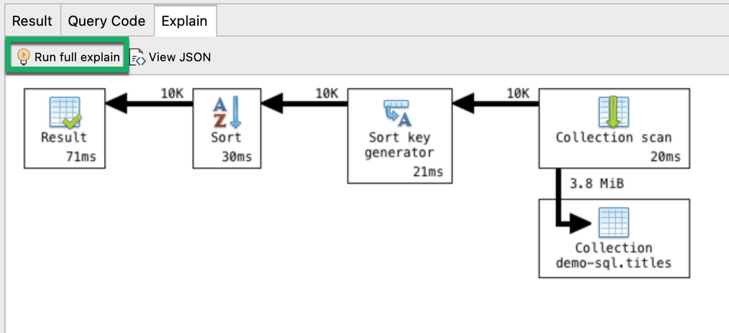
What information can we gather from this?
- It took MongoDB 20 milliseconds to run the collection scan
A collection scan means that the query looked at each document to get the results.
2. 10,000 documents were passed at each stage
3. It took MongoDB 21 milliseconds to run the Sort key generator stage and another 30 milliseconds to run the Sort stage.
4. The whole query took 71 milliseconds to run.
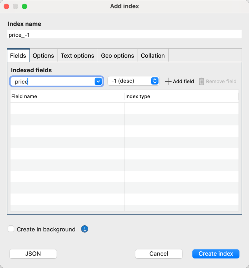
Now, how can we optimize this query?
If you often find yourself sorting price in descending order, then it is best to create an index on the field price.
Now that the index is set up, let’s run the same query again (and this time, we expect it to be faster).
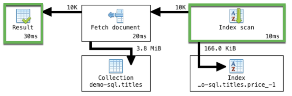
Indeed, MongoDB runs the same query much faster, at 30ms (versus 71ms).
Instead of using a collection scan which took 20ms, MongoDB chose an index scan which only took 10ms. The database detected that an appropriate index exists for the query, so it scanned a limited number of documents, instead of needlessly scanning each one.
By choosing the index scan, the database was also able to skip the sort stages, and instead went straight to fetching the documents, resulting in 41ms saved.
Spot uneven shard loads
MongoDB uses sharding to horizontally scale data, which it tries to evenly distribute across shards – but this is not always the case.
Visual Explain can come in handy for spotting imbalanced loads when you’re querying a sharded database.
Take for example the screenshot below of crimes, a collection of about 2,486,000 documents, hosted on a database with two shards.
To test, we run an empty query and discover that:
- Shard 1 handled 1.6 million documents
- Shard 2 handled 893K documents

Now we know that the database isn’t distributing the workload evenly as expected. Shard 1 is handling almost twice the load.
We can then move on to the next steps of investigating the sharded cluster balancer or chunk size to fix a bigger issue, which Visual Explain helped us uncover.
Optimize queries by applying relevant filters first
When it comes to querying, the best practice is to apply operators that do the most filtering first.
Visual Explain is an ideal way to check if this is being done.
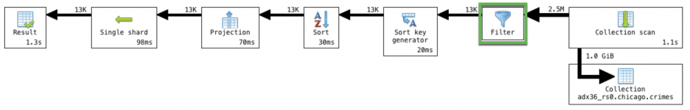
Using the same crimes collection from above, we’d like to know how many cases of theft occurred on Chicago’s public transport system, Chicago Transit Authority (CTA).
We’d also like to sort these cases in descending order by date, and we’d only like to see the four relevant fields _id, location.description, primary_type (of crime), and date.
Here’s the full query that was run in Visual Query Builder:
db.getCollection("crimes").find(
    {
        "location.description" : /.*cta.*/i,
        "primary_type" : "Theft"
    },
    {
        "_id" : 1.0,
        "location.description" : 1.0,
        "primary_type" : 1.0,
        "date" : 1.0
    }
).sort(
    {
        "date" : -1.0
    }
);
Now let’s click on the Explain tab.
What we see is exactly what we want to happen: the database is applying the filter operator first.
From the original 2.5M documents, only 13K meet the filter criteria and are then passed on to the later stages.
If Visual Explain shows you that this isn’t the case, then the next step would be to debug your query.
A way to debug
Say, for example, that you wanted to know how many customers have priority support and live in Kansas, from your pool of 1,000 customers.
You already have a hunch that this can’t be a big number, but Visual Explain shows that 485 documents – 485 customers – meet the criteria:

This is clearly way too large a number that could only point to an error in your query logic. (Do you spot the $ne operator? 🙂 )
While this is a simple example, it still illustrates the usefulness of having a quick and visual way of double-checking the soundness of your query.
Brief vs. Full Mode
By default, Visual Explain shows the explain plan diagram in brief mode without runtime statistics, like this:

It’s fast and always available for all queries, without delay.
Full mode, on the other hand, shows both the stages and runtime statistics:

It requires running the query, which might cause a delay depending on its size.
To show full mode, click the Run full explain button in the Explain tab toolbar.
Hover over elements
You can hover over all elements in full mode to show additional help text, for example:
Arrows
Runtime statistics
Hovering over runtime statistics displays information such as the estimated number of bytes processed by the stage:

Or the full document count (for example, 1007 documents instead of 1.0K):

Or the time it took to execute an individual stage, or the whole query if you hover over the Result block:

Query stages
Behind every MongoDB query is a query plan, and Visual Explain displays how this plan was executed, stage by stage.
View full description
To view a stage’s full description, right-click and select What’s this?.

Runtime statistics
Visual Explain’s full mode displays runtime statistics, such as:
Stage output (number of documents produced)

Shows the number of documents produced by a stage.
Execution time

Tracks the number of milliseconds it took to execute a stage.
Amount of data processed

Displays the estimated amount of data processed to carry out the operation.
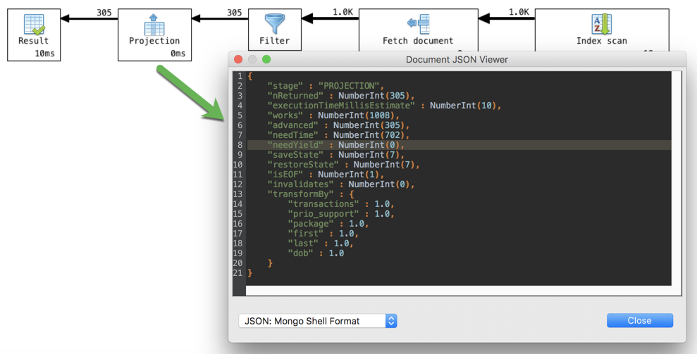
View the original query plan in JSON
You can view the query plan as a JSON document. Click on the View JSON button.
View a specific stage’s query plan in JSON
The original JSON document contains a lot of information not visible in the diagram, but it tends to be very nested and difficult to work with. To spare the back-and-forth scrolling for those who are interested in this extra information, Visual Explain makes it much easier to view a specific stage’s JSON fragment.
To show the extra information, right-click on a stage block and select View original JSON fragment.
Note that this displays only that stage’s JSON fragment and not the full query plan.
List of supported query stages
This article was originally published by Kathryn Vargas and has since been updated.