In this post, we’re going to demonstrate a simple way of building and running an aggregation against a MongoDB database using tools in Studio 3T, the IDE for MongoDB.
We will then show how easy it is to render the results visually by using the built-in Charts function that is available in all tiers of MongoDB Atlas.
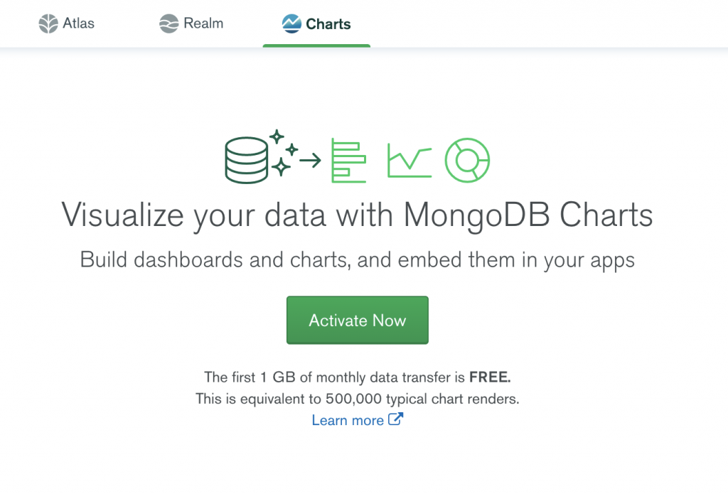
MongoDB Charts lets you create visual representations of your data, from bar and column charts to heatmaps and word clouds. Within Atlas, MongoDB offers the first 512MB of monthly data transfer for free, which is equivalent to 500,000 typical chart renders.
The basic steps that we’ll cover are:
Step 1 – Import a CSV file of some Demo-Data into Studio 3T
Step 2 – Use the Aggregation Editor to get the results we’re after
Step 2A: Write a SQL query to get the same results
Step 3 – Save the Aggregation that we’ve built as a View
Step 4 – Connect our MongoDB Atlas cluster to that View as our data source
Step 5 – Pull the Aggregation results into MongoDB Charts to render them visually
Step 1 – Import your data
For this tutorial, we’re starting with a dummy set of data that you can download here. It could be in an Excel spreadsheet or Google Sheets or whatever spreadsheet package you may be using. The first thing we want to do is save a local copy of the data as a CSV file.
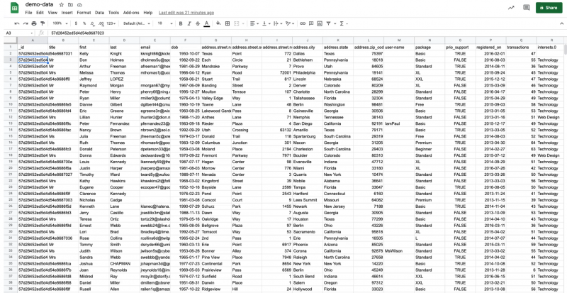
Now let’s jump over to Studio 3T and import the CSV file as a collection of 1,000 JSON documents.
If you haven’t yet, Download the latest Studio 3T version and get started.
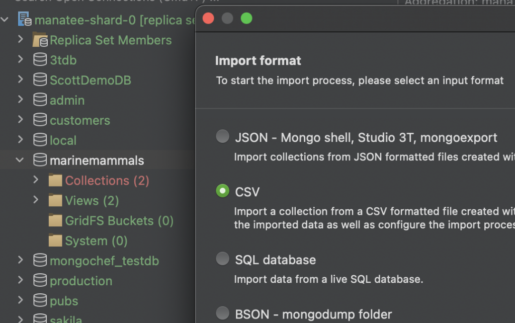
It’s a simple matter of right-clicking on a database and selecting Import Collections from the menu.
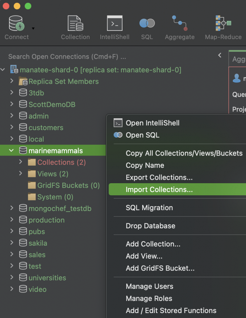
The menu offers a variety of formats that your data might be in, including JSON, CSV, SQL, and different flavors of BSON.
We’ll select CSV.
After hitting next, the Import configuration dialog appears, where you can configure the details of the source data and the target collection.
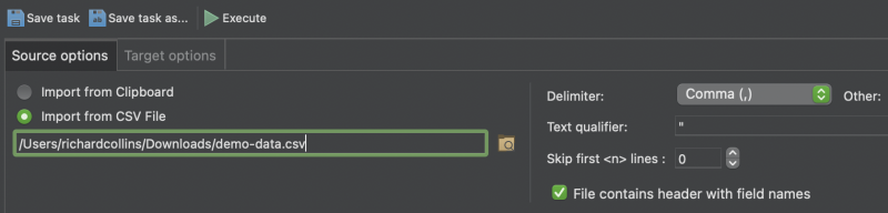
Here, in the Source options tab, we have browsed to find the correct path of the .csv file we wish to import.
Once you have configured the import to suit your needs, you can simply hit the green arrow icon to run the Import.
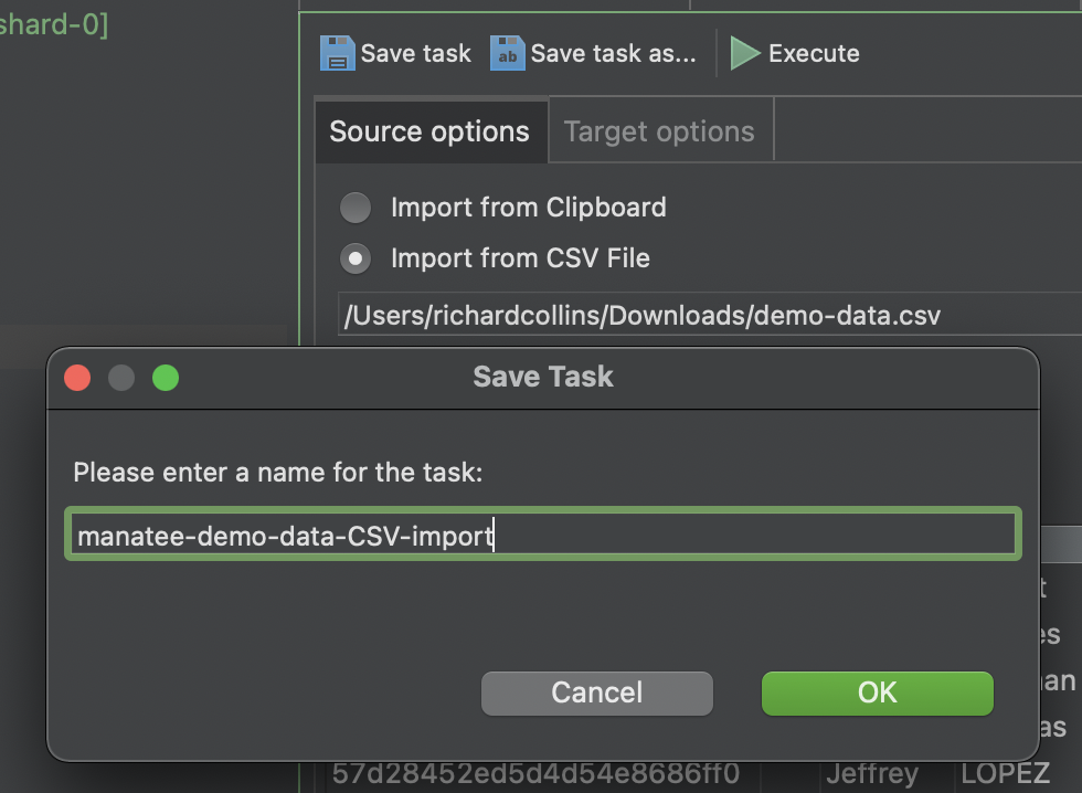
We recommend saving the Import as a pre-set Task in case you need to run the same import job again in the future.
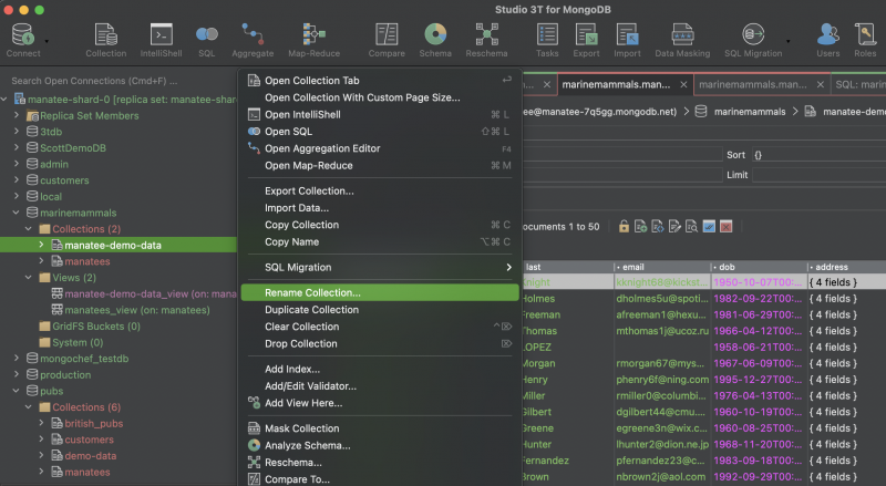
After hitting Run (Execute) we now have our original spreadsheet data in a MongoDB collection in Studio 3T. We’ll also take the opportunity to rename the collection to manatee-demo-data, by simply selecting ‘rename collection’ from the right-click menu.
Step 2 – Build and execute the Aggregation
There is a field in our demo-data named ‘package’ and the question we want to answer is: “What is the average number of transactions per package type?” Or in other words, which package size correlates with the most purchases per customer?.
Open the Aggregation Editor via the Aggregate icon on the main toolbar.
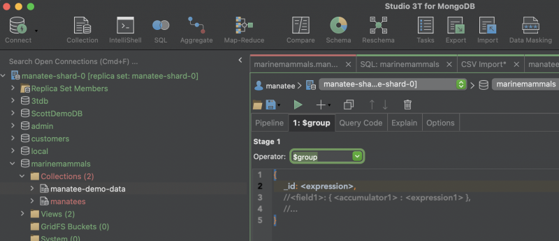
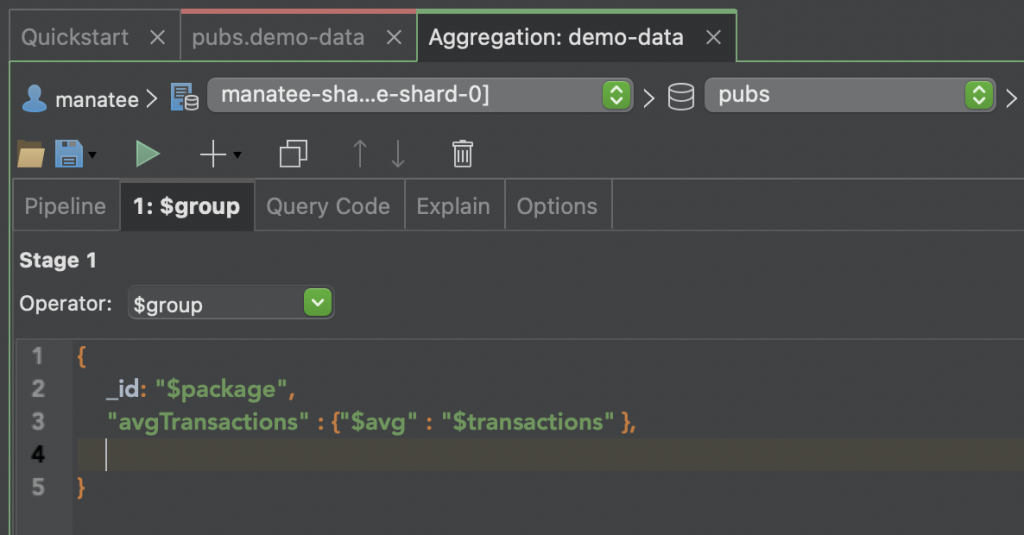
We can add a stage in the aggregation pipeline by clicking on the ‘+’ sign. Then select the ‘$group’ operator from the dropdown menu and add the expression ‘$package’ option from the auto-completion menu.
Now combine this ‘$package’ information with ‘$transactions’ using the ‘$avg’ operator to complete the aggregation.
When you run the aggregation (by clicking the green arrowhead) we get the results we’re looking for, indicating that the Beginner package is the most popular.
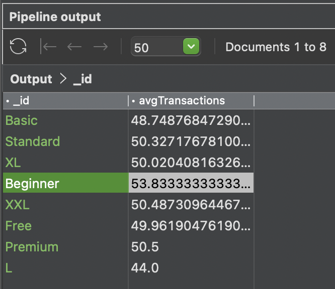
NB1: If your data set has incomplete documents the “_id”: “$package” field will include a NULL value. This can be removed from the data set by adding a prior Stage 1: $match {“package” : {“$ne” : null} }
NB2: We use the fixed width courier font for code examples in this article. If you copy and paste the samples, the quotemarks will need replacing to avoid throwing an exception.
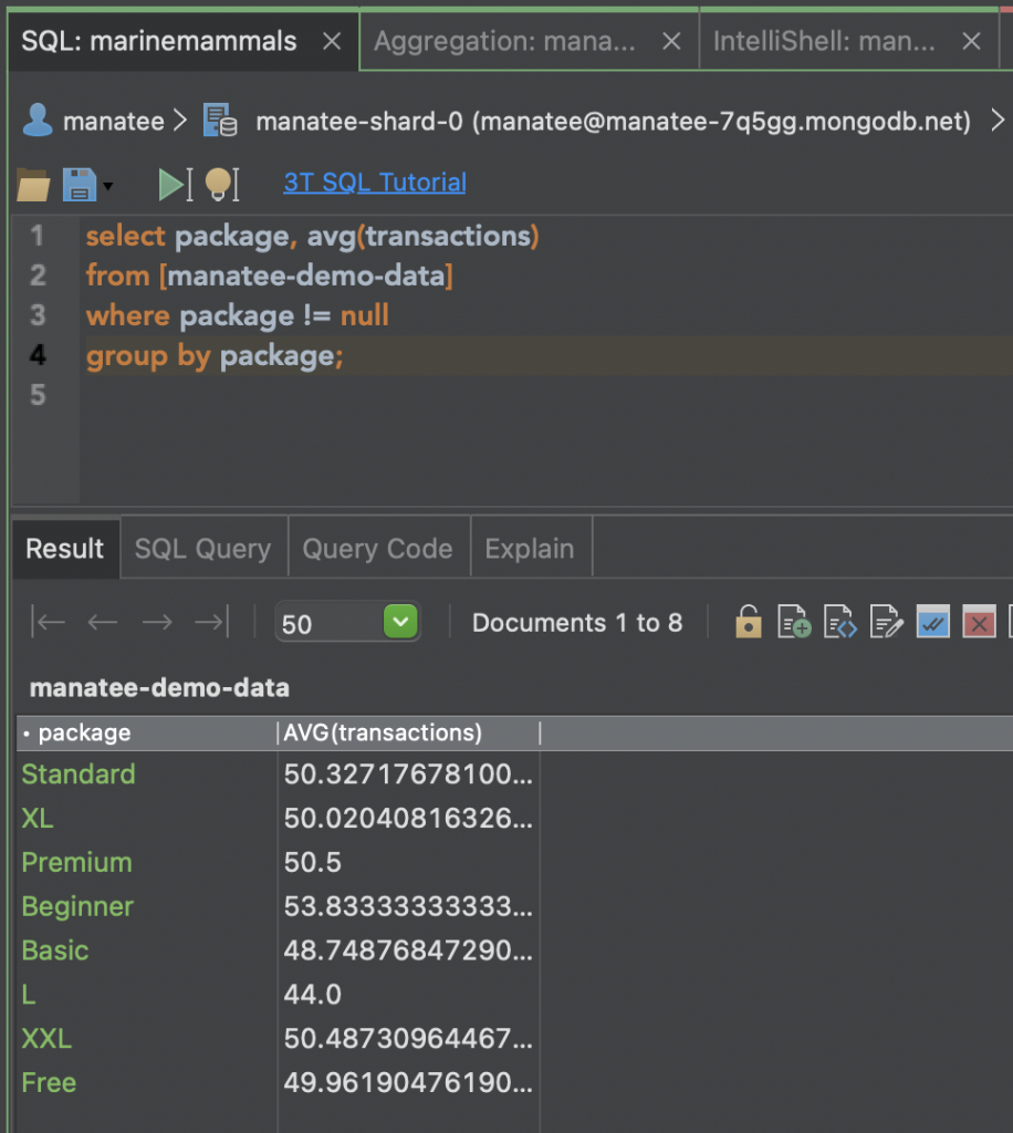
Step 2A – Running a SQL query instead, to get the same results
If you’re coming to MongoDB with prior experience of looking after relational databases, you may be more comfortable writing a SQL query instead of a mongo shell aggregation as outlined above.
In which case, you can use the SQL Query tool by selecting the icon (to the left of the Aggregate icon) from the main toolbar:
Using the SQL Query tool you can write your query and then check in the ‘Result’ tab below that the results you’re getting are the same as with the aggregation above. The two scripts produce the same results, except for a difference in the naming of the newly created field. The aggregation produces avgTransactions while the SQL query creates it as AVG(Transactions).
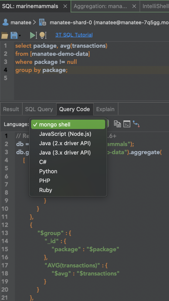
To the right of the Result tab, the Query Code tab is a useful way of generating the equivalent code to your SQL query in half a dozen languages (see image below), including mongo shell.
It’s a neat tool for teaching yourself mongo shell scripting if you already know some SQL; not to mention saving days of work when scripting out driver code in languages as verbose as Java or C#.
Step 3 – Create the View
Now we have the data we’re looking for. But before we can visualize it in MongoDB Atlas, we need to go back to our Aggregation and save it as a preset View which we can point to as our data source.
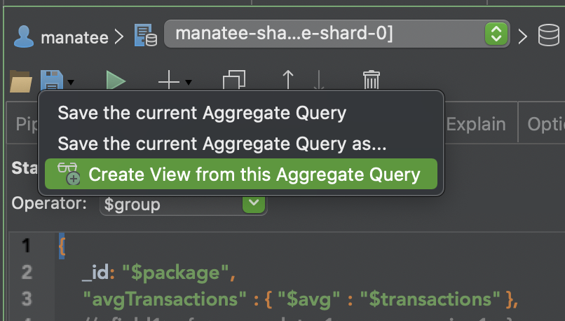
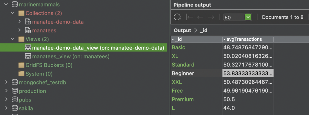
That View then gets saved in association with our manatee-demo-data collection in the Connection Tree. You can now reference the Aggregation and its output at any time with just a couple of clicks.
Step 4 – Connect the Atlas cluster to the newly created View
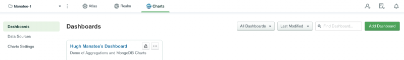
So let’s open up our Atlas cluster, and click on Charts.
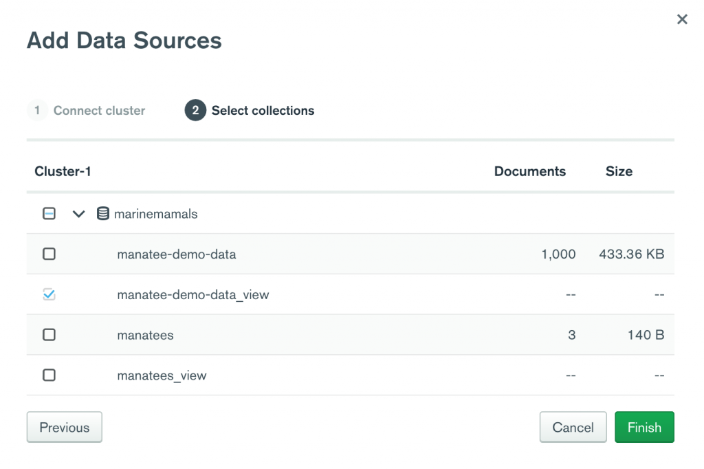
On the left-hand menu, click on Data Sources. Choose Add Data Source, on the far right of the screen.

Now we can drill down through our collections to select the view we’ve just saved, the file called manatee-demo-data_view.
Step 5 – Create the Chart
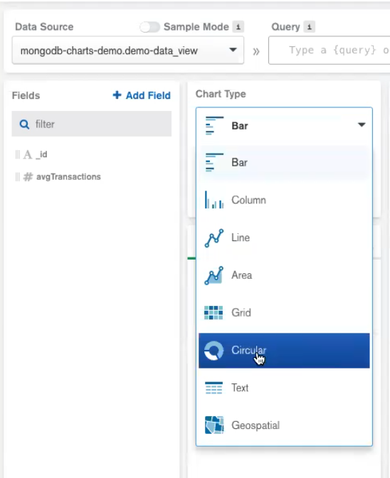
Now we’ve got our aggregation View hooked up as a data source in Charts, let’s build the chart. Click on Dashboards on the left-hand menu. Click on Add Dashboard to create a new one, or click on a pre-existing dashboard. In this case, we can use Hugh Manatee’s dashboard.
Inside the dashboard area, there is an option to Add Chart.
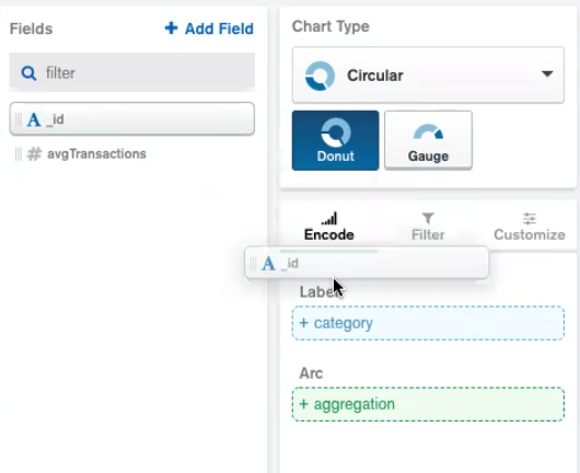
A variety of chart types is available but for this demo, we’ll use the simplest donut chart.
We then need to drag and drop the original package containing the list of different package sizes (in this case “_id”) into the Category field and the set of average transaction values (“avgTransactions”) into the Aggregation container. These are available in the Encode panel, beneath the chart type picker.
Charts renders the data as soon as it’s been added. Using the chart legend on the far right we can select or deselect different data segments, for maximum legibility.
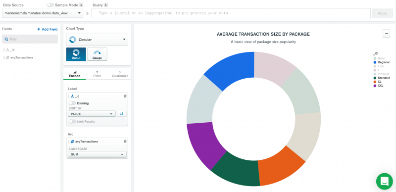
Finally, in the top right corner, you can “Save and Close”, thereby adding the chart to your own cluster dashboard:
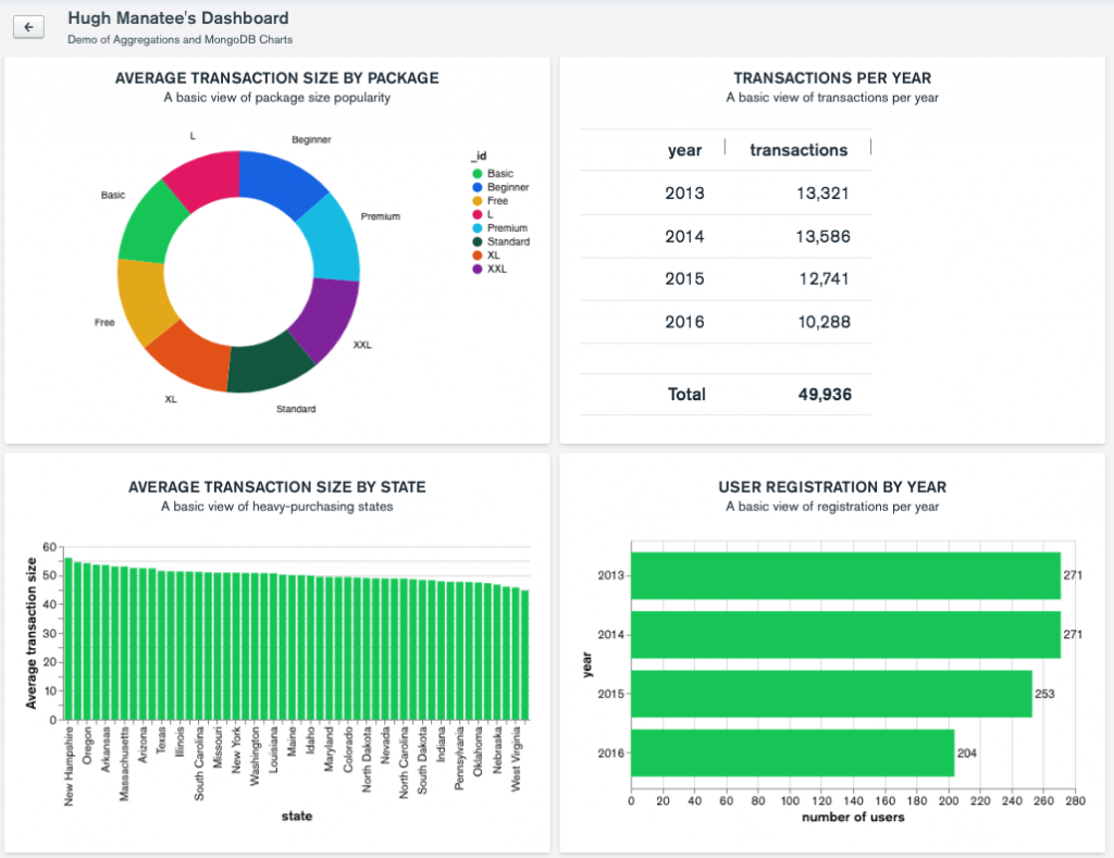
This was a very simple aggregation, but the simplicity of this approach comes into its own when you have a series of complex aggregations that you need to make visually legible for reporting purposes.
MongoDB Charts is a great data visualization tool that is available free with your MongoDB Atlas cluster. Using the point-and-click data management simplicity of Studio 3T in conjunction with Charts provides a simple and easy solution for fast and effective data reporting for MongoDB.